Lash Sensational Firework Electro Black Máscara de pestañas
Lash Sensational Firework Electro Black Máscara de pestañas
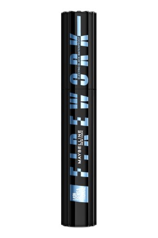
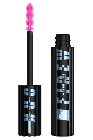
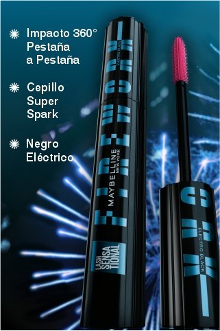
Electro Black Waterproof
Al hacer clic en este botón, te adentrarás en una experiencia de realidad aumentada.
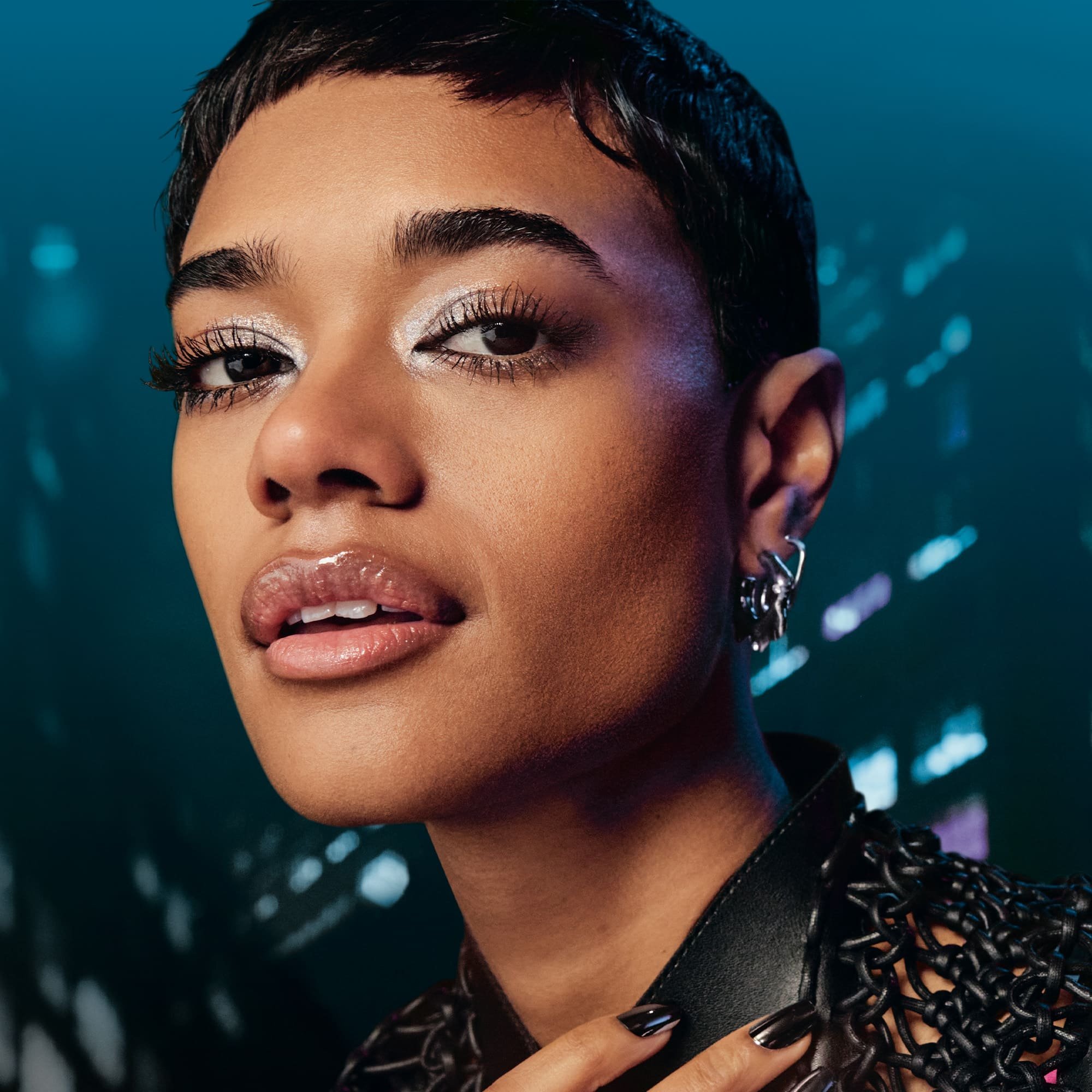
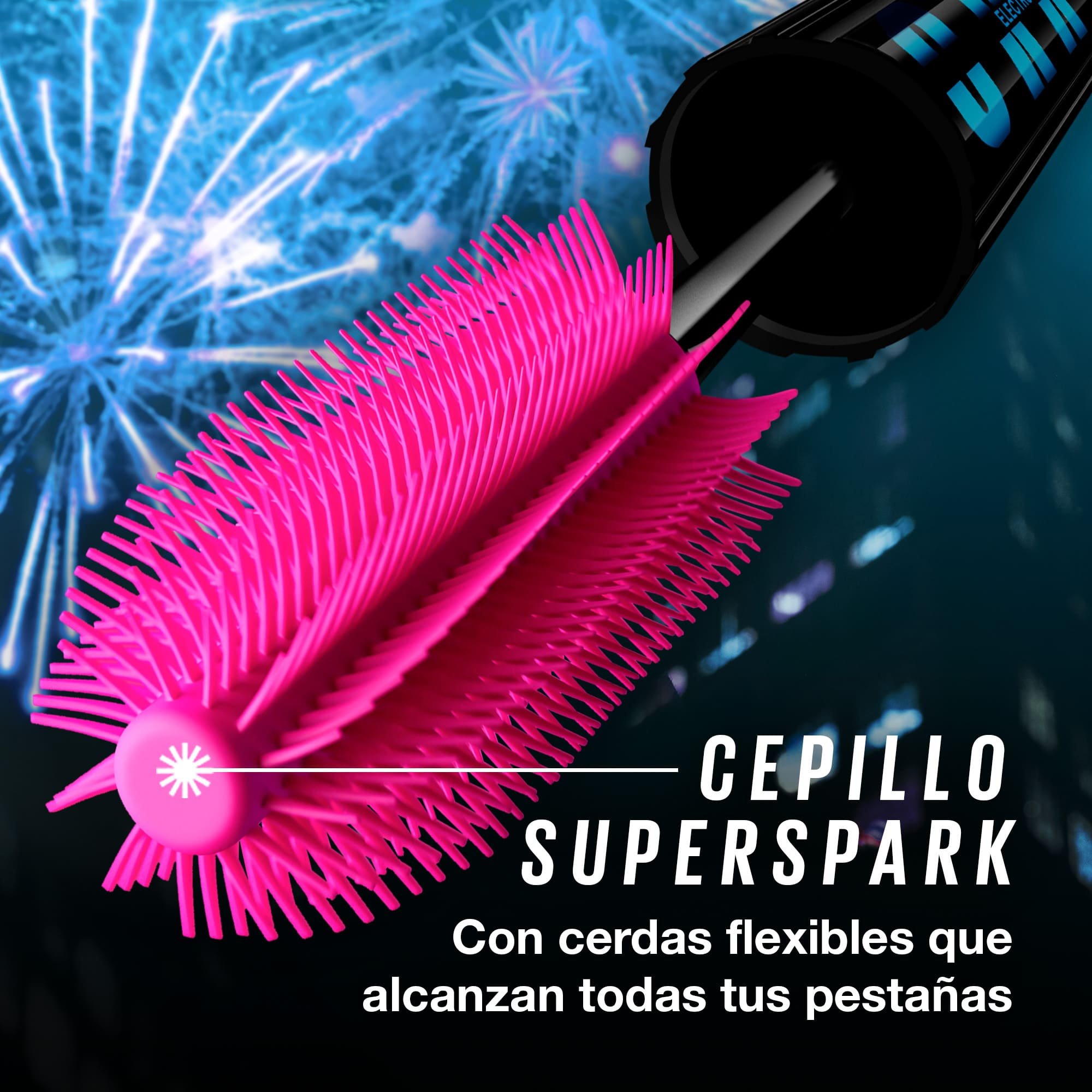
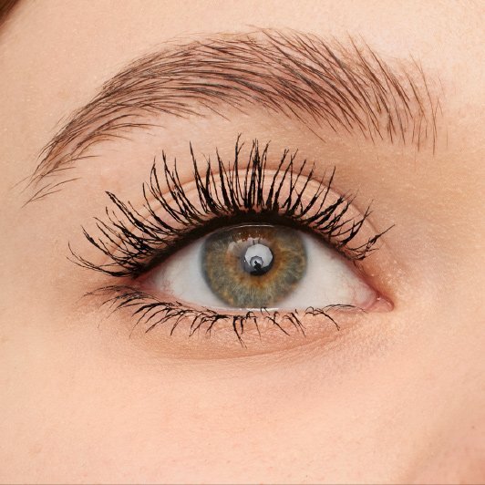
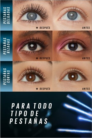
Transformá tu mirada con la nueva máscara Lash Sensational Firework Electro Black a prueba de agua para lograr un efecto de pestañas explosivas ahora con acabado negro eléctrico. Disfrutá de una mirada espectacular hasta por 24 horas sin perder volumen y longitud. Resistente al agua.
NUESTRO COMPROMISO
-
Probado antialergias
-
oftalmológica- mente
-
Apto para quienes usan lentes de contacto